Product Design
Oct 2024 – Present
Redesigning a Pension Platform
A UI audit and systemization of a live, public-sector pension census and actuarial-management platform.

UI Audit
Design System
Reports & Dashboards
Challenge
The product was already live and doing its job. The trouble was everything that had piled up around it over time. Typography and color were applied unevenly, components that looked the same behaved differently, and the densest screens had almost no hierarchy to lean on. For the people working in it all day, that meant more to decode and more room for mistakes, and it made the product slow and risky to change. My job was to bring order to the UI of a system that was already in production, without touching the business rules underneath it.
Outcomes
The interface got more consistent and the team got a steadier base to build on. New screens now start from a clear logic instead of solving the same problems again from zero. Administrators and the operations team gave good feedback, and visual rework came up less often. I don’t have hard percentages for any of this, and I’d rather say that plainly than invent a number I can’t stand behind.
Flows audited and reviewed
Flows audited and reviewed
Municipalities supported
Municipalities supported
Public employees served
Public employees served
Context & Objective
This was an internal platform for municipal pension census and actuarial management. It ran on dense forms, the same data structures repeated across many screen types, and a lot of routine administrative work. The scale is real: the platform backs more than 600 actuarial assessments and the pension records of over 70,000 public employees.
I was the only UI and product designer on a small team. I wanted to take a live product and give it an interface that holds together and can grow, so it reads more clearly and behaves more predictably, while leaving the business rules it already runs on untouched.

Context, challenge, and outcome at a glance
Discover
I couldn’t redesign screens one at a time until I understood the system they belonged to.
Initial situation
A few screens looked dated, but the deeper issue was that the product didn’t agree with itself. The same kind of information showed up in different shapes, repeated elements behaved differently from one place to the next, and the layouts weren’t following any shared logic. On the heavy data screens it got worse: barely any hierarchy, contrast that was hard to read, and a lot for the daily users to keep in their heads.
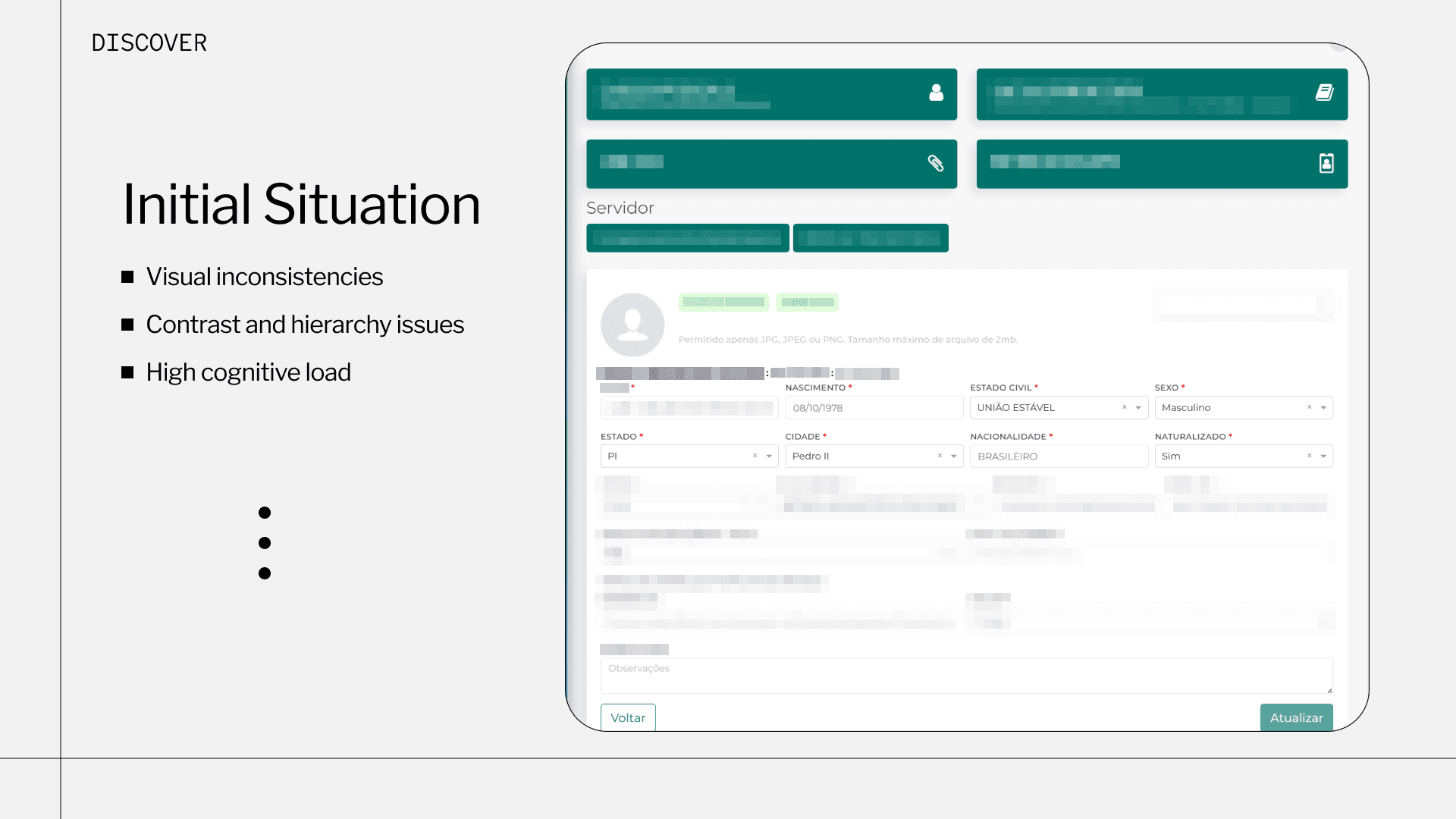
Legacy server-registration screen: dense form, weak hierarchy, inconsistent contrast
Audit & ‘as-is’ diagnosis
So I audited it, both the look and the structure. I walked the flows, pulled screens straight from production, and went through the interface in Figma piece by piece. I logged everything from the small stuff like type, color, and fields up to the bigger structures: form blocks, tables, page templates. As I went, I grouped what repeated and marked where the patterns fell apart. That added up to more than 50 flows. Doing it this way pulled me out of patching single screens and let me sort the work by what showed up most and what mattered most.

Audit board in Figma: production screens and components grouped by type
Define
Redesign strategy & component logic
Once I knew what I was dealing with, I gave the work a fixed path instead of redesigning by gut: survey, prioritize, review the flow, define the pattern, then redesign. What got worked on first came down to real demand and the journeys people actually relied on.
For every element I kept asking the same plain questions. Does this really need to be new, or does something we already have cover most of it? Does the user need to see all of this at the same time? Can the task be done in fewer screens? Keeping those front of mind meant I reused far more than I reinvented.

Redesign decision flow: survey, prioritize, flow review, defining standards, redesign
Building the Foundation
Style guide & UI foundation
From there I rebuilt the visual base from the ground up, working structure first and applying it after: fundamentals, then components, then templates and full pages. I set the typography, fixed the hierarchy, pinned down what each color was for, wrote spacing rules, and built components and their states so they could be reused.
The goal was a system that’s easier to maintain, easier to extend, and consistent from one screen to the next. A pile of one-off visual choices became a design language the team can keep using.

UI foundation: type scale, color roles, and key components with their states

The Census design system: variables, components, and patterns in Figma
Before & After
Examples are anonymized and fragmented for confidentiality.
Server detail form
The registration and detail screens were the most packed. I reorganized how the content was structured, grouped fields that belonged together, evened out the spacing, and used the same component logic throughout. Same information as before, just much easier to scan and make sense of.

Before / after: server detail form
Statement / timeline view
For the record-heavy views, I swapped the flat tables that were hard to read for a clearer structure and a timeline. Now you can actually follow the history of a record instead of squinting at rows.

Before / after: account statement and contribution timeline
Reports & statistics dashboard
The reports area turned into a single overview dashboard. The indicators sit together, the grouping makes sense, and the charts are handled the same way throughout, so an administrator can read the census at a glance instead of piecing together scattered widgets.

Before / after: reports and statistics dashboard
Handoff & Collaboration
The team was small and I worked closely with engineering, so handoff was more of a conversation than a stack of documents. I handed over the main flows step by step with the specs they needed, recorded short audio and video walkthroughs to explain how things should behave, and went through screens and flows with the developers one by one, signing off or fixing as we went and staying inside the architecture they already had. I wanted just enough clarity for them to build it and keep it running, not documentation for its own sake.
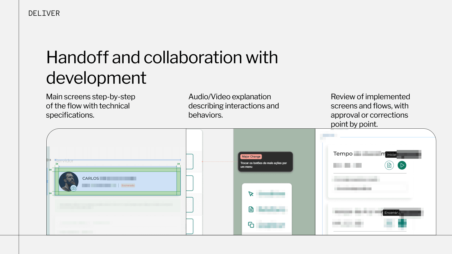
Handoff: technical specs, recorded walkthroughs, and point-by-point review
Outcomes
After the redesign the product felt more consistent and moved faster. The recurring inconsistencies settled into something more standard. Designing screen by screen turned into defining things once and reusing them. Decisions that used to be one-off and reactive started coming from a steadier, more predictable base. Administrators and the operations team gave good feedback, and the visual reviews and corrections that used to keep coming back showed up less.

Outcomes: from inconsistency and slow, isolated work to standardization and reuse
Final Thoughts
What I like about this project is that it shows the structural side of UI work: reading the context, working out what’s actually wrong, building patterns, designing for scale, and collaborating closely with the people who implement it. That’s the kind of work I do best: taking interfaces that have drifted apart and pulling them back into something coherent that can grow, without losing the eye for how they read along the way.
Context & Objective
This was an internal platform for municipal pension census and actuarial management. It ran on dense forms, the same data structures repeated across many screen types, and a lot of routine administrative work. The scale is real: the platform backs more than 600 actuarial assessments and the pension records of over 70,000 public employees.
I was the only UI and product designer on a small team. I wanted to take a live product and give it an interface that holds together and can grow, so it reads more clearly and behaves more predictably, while leaving the business rules it already runs on untouched.
Context, challenge, and outcome at a glance
Discover
I couldn’t redesign screens one at a time until I understood the system they belonged to.
Initial situation
A few screens looked dated, but the deeper issue was that the product didn’t agree with itself. The same kind of information showed up in different shapes, repeated elements behaved differently from one place to the next, and the layouts weren’t following any shared logic. On the heavy data screens it got worse: barely any hierarchy, contrast that was hard to read, and a lot for the daily users to keep in their heads.
Legacy server-registration screen: dense form, weak hierarchy, inconsistent contrast
Audit & ‘as-is’ diagnosis
So I audited it, both the look and the structure. I walked the flows, pulled screens straight from production, and went through the interface in Figma piece by piece. I logged everything from the small stuff like type, color, and fields up to the bigger structures: form blocks, tables, page templates. As I went, I grouped what repeated and marked where the patterns fell apart. That added up to more than 50 flows. Doing it this way pulled me out of patching single screens and let me sort the work by what showed up most and what mattered most.
Audit board in Figma: production screens and components grouped by type
Define
Redesign strategy & component logic
Once I knew what I was dealing with, I gave the work a fixed path instead of redesigning by gut: survey, prioritize, review the flow, define the pattern, then redesign. What got worked on first came down to real demand and the journeys people actually relied on.
For every element I kept asking the same plain questions. Does this really need to be new, or does something we already have cover most of it? Does the user need to see all of this at the same time? Can the task be done in fewer screens? Keeping those front of mind meant I reused far more than I reinvented.
Redesign decision flow: survey, prioritize, flow review, defining standards, redesign
Building the Foundation
Style guide & UI foundation
From there I rebuilt the visual base from the ground up, working structure first and applying it after: fundamentals, then components, then templates and full pages. I set the typography, fixed the hierarchy, pinned down what each color was for, wrote spacing rules, and built components and their states so they could be reused.
The goal was a system that’s easier to maintain, easier to extend, and consistent from one screen to the next. A pile of one-off visual choices became a design language the team can keep using.
UI foundation: type scale, color roles, and key components with their states
The Census design system: variables, components, and patterns in Figma
Before & After
Examples are anonymized and fragmented for confidentiality.
Server detail form
The registration and detail screens were the most packed. I reorganized how the content was structured, grouped fields that belonged together, evened out the spacing, and used the same component logic throughout. Same information as before, just much easier to scan and make sense of.
Before / after: server detail form
Statement / timeline view
For the record-heavy views, I swapped the flat tables that were hard to read for a clearer structure and a timeline. Now you can actually follow the history of a record instead of squinting at rows.
Before / after: account statement and contribution timeline
Reports & statistics dashboard
The reports area turned into a single overview dashboard. The indicators sit together, the grouping makes sense, and the charts are handled the same way throughout, so an administrator can read the census at a glance instead of piecing together scattered widgets.
Before / after: reports and statistics dashboard
Handoff & Collaboration
The team was small and I worked closely with engineering, so handoff was more of a conversation than a stack of documents. I handed over the main flows step by step with the specs they needed, recorded short audio and video walkthroughs to explain how things should behave, and went through screens and flows with the developers one by one, signing off or fixing as we went and staying inside the architecture they already had. I wanted just enough clarity for them to build it and keep it running, not documentation for its own sake.
Handoff: technical specs, recorded walkthroughs, and point-by-point review
Outcomes
After the redesign the product felt more consistent and moved faster. The recurring inconsistencies settled into something more standard. Designing screen by screen turned into defining things once and reusing them. Decisions that used to be one-off and reactive started coming from a steadier, more predictable base. Administrators and the operations team gave good feedback, and the visual reviews and corrections that used to keep coming back showed up less.
Outcomes: from inconsistency and slow, isolated work to standardization and reuse
Final Thoughts
What I like about this project is that it shows the structural side of UI work: reading the context, working out what’s actually wrong, building patterns, designing for scale, and collaborating closely with the people who implement it. That’s the kind of work I do best: taking interfaces that have drifted apart and pulling them back into something coherent that can grow, without losing the eye for how they read along the way.
Context & Objective
This was an internal platform for municipal pension census and actuarial management. It ran on dense forms, the same data structures repeated across many screen types, and a lot of routine administrative work. The scale is real: the platform backs more than 600 actuarial assessments and the pension records of over 70,000 public employees.
I was the only UI and product designer on a small team. I wanted to take a live product and give it an interface that holds together and can grow, so it reads more clearly and behaves more predictably, while leaving the business rules it already runs on untouched.
Context, challenge, and outcome at a glance
Discover
I couldn’t redesign screens one at a time until I understood the system they belonged to.
Initial situation
A few screens looked dated, but the deeper issue was that the product didn’t agree with itself. The same kind of information showed up in different shapes, repeated elements behaved differently from one place to the next, and the layouts weren’t following any shared logic. On the heavy data screens it got worse: barely any hierarchy, contrast that was hard to read, and a lot for the daily users to keep in their heads.
Legacy server-registration screen: dense form, weak hierarchy, inconsistent contrast
Audit & ‘as-is’ diagnosis
So I audited it, both the look and the structure. I walked the flows, pulled screens straight from production, and went through the interface in Figma piece by piece. I logged everything from the small stuff like type, color, and fields up to the bigger structures: form blocks, tables, page templates. As I went, I grouped what repeated and marked where the patterns fell apart. That added up to more than 50 flows. Doing it this way pulled me out of patching single screens and let me sort the work by what showed up most and what mattered most.
Audit board in Figma: production screens and components grouped by type
Define
Redesign strategy & component logic
Once I knew what I was dealing with, I gave the work a fixed path instead of redesigning by gut: survey, prioritize, review the flow, define the pattern, then redesign. What got worked on first came down to real demand and the journeys people actually relied on.
For every element I kept asking the same plain questions. Does this really need to be new, or does something we already have cover most of it? Does the user need to see all of this at the same time? Can the task be done in fewer screens? Keeping those front of mind meant I reused far more than I reinvented.
Redesign decision flow: survey, prioritize, flow review, defining standards, redesign
Building the Foundation
Style guide & UI foundation
From there I rebuilt the visual base from the ground up, working structure first and applying it after: fundamentals, then components, then templates and full pages. I set the typography, fixed the hierarchy, pinned down what each color was for, wrote spacing rules, and built components and their states so they could be reused.
The goal was a system that’s easier to maintain, easier to extend, and consistent from one screen to the next. A pile of one-off visual choices became a design language the team can keep using.
UI foundation: type scale, color roles, and key components with their states
Before & After
Examples are anonymized and fragmented for confidentiality.
Server detail form
The registration and detail screens were the most packed. I reorganized how the content was structured, grouped fields that belonged together, evened out the spacing, and used the same component logic throughout. Same information as before, just much easier to scan and make sense of.
Before / after: server detail form
Statement / timeline view
For the record-heavy views, I swapped the flat tables that were hard to read for a clearer structure and a timeline. Now you can actually follow the history of a record instead of squinting at rows.
Before / after: account statement and contribution timeline
Reports & statistics dashboard
The reports area turned into a single overview dashboard. The indicators sit together, the grouping makes sense, and the charts are handled the same way throughout, so an administrator can read the census at a glance instead of piecing together scattered widgets.
Before / after: reports and statistics dashboard
Handoff & Collaboration
The team was small and I worked closely with engineering, so handoff was more of a conversation than a stack of documents. I handed over the main flows step by step with the specs they needed, recorded short audio and video walkthroughs to explain how things should behave, and went through screens and flows with the developers one by one, signing off or fixing as we went and staying inside the architecture they already had. I wanted just enough clarity for them to build it and keep it running, not documentation for its own sake.
Handoff: technical specs, recorded walkthroughs, and point-by-point review
Outcomes
After the redesign the product felt more consistent and moved faster. The recurring inconsistencies settled into something more standard. Designing screen by screen turned into defining things once and reusing them. Decisions that used to be one-off and reactive started coming from a steadier, more predictable base. Administrators and the operations team gave good feedback, and the visual reviews and corrections that used to keep coming back showed up less.
Outcomes: from inconsistency and slow, isolated work to standardization and reuse
Final Thoughts
What I like about this project is that it shows the structural side of UI work: reading the context, working out what’s actually wrong, building patterns, designing for scale, and collaborating closely with the people who implement it. That’s the kind of work I do best: taking interfaces that have drifted apart and pulling them back into something coherent that can grow, without losing the eye for how they read along the way.

Conclusion
The Census design system: variables, components, and patterns in Figma