Product Design
2024
Optimizing the Self-Service Journey in Laboratories
Redesigning Dasa's self-service kiosks (Totems) for legibility and clarity across 900+ diagnostic units.

UI Design
Field Research
Usability Testing
Challenge
Dasa was rolling a self-service kiosk and queue system into 324 diagnostic units in 2023. By then the kiosk's finalization step had grown into a tangle of screens, a different one for almost every combination of patient-state flags. The screen itself made it worse: it was dim and caught glare, so it fought back in bright, busy lobbies.
Outcomes
I collapsed those finalization states into a smaller, consistent set, and reframed the kiosk as a digital host that sells Check-in on a concrete benefit: skip the counter, get priority in the queue. Every visual call came back to something we'd seen in the field or in a usability test, and where a choice affected conversion, we measured it instead of arguing about it.
diagnostic units in the 2023 rollout
diagnostic units in the 2023 rollout
journey and interaction flows documented
journey and interaction flows documented
finalization states unified into a smaller set
finalization states unified into a smaller set
Context & objective
T1, T2, T3: the patient journey
Dasa runs a network of 900+ diagnostic units and labs across Brazil. Inside a unit, the trip from arrival to exam is measured in three segments:
T1: arrival and queue ticket at the kiosk
T2: waiting to be called to the reception desk
T3: waiting for sample collection (e.g. blood draw)
The team’s big bet was “T2 = 0”: let an eligible patient skip the reception counter altogether. They authorize and pay on their phone and walk straight to the exam, so the T2 wait drops to zero. Digital Check-in, a mobile pre-admission flow, was what made that possible, and the self-service kiosk, called the Totem internally, was the in-unit bridge that pushed people toward it.

journey diagram, T1/T2/T3 and the skip-the-counter shortcut
The kiosk as a “digital host”
The idea was to make the kiosk behave like a digital host: read the patient on arrival and send them down the right path. Walk-ins go to Check-in; eligible patients go into the T2=0 flow. The in-house queue software, Tracking, was becoming the company’s official ticketing system.
It shipped in waves across 324 units in 2023. Phase 1 delivered the T1 and T2 modules: the queue ticket at the kiosk, the panels, and everything up to the counter. Phase 2 added the T3 collection-queue module in September. Units with the most check-in and T2=0 potential went first.

rollout phases, T1+T2 first, then T3
My role
I was the Product Designer on the UI redesign of the kiosk screens, in a chapter that also had a service designer and a UX researcher, working alongside product and engineering. Cutting down the flow explosion was a team effort. The visual redesign was mine: contrast, layout, information hierarchy, and the direction of the copy.
Problem
A different screen for every scenario
The kiosk’s finalization step branched on a handful of patient-state flags, and the screen changed with almost every combination. Without getting into the rules themselves, the rough shape was enough to explain the mess:
Check-in: 2 states
Registration: 3 states
Eligibility for the skip-the-counter path: 2 states
Appointment status: 3 states
Priority: 2 states
A handful of special cases on top
Multiply those out and you’re into the dozens. In practice they’d hardened into 18+ distinct finalization screens, and a patient in a hurry still had to read whichever one they got at a glance. As someone put it in an alignment meeting, “there’s a different case for each scenario.”

the sprawl of finalization screens
The screen wasn’t a normal monitor
The kiosk screen behaved nothing like the display I designed on, and that shaped every decision. A few things mattered more than any spec sheet:
Size and resolution were closer to a tablet than a desktop monitor, so there wasn’t much room and everything had to be bigger than it feels in Figma.
Contrast and color were off from a normal laptop or monitor, so a screen that looked clean in the Figma preview could come out washed out or muddy once it was actually running on the kiosk. I learned to stop trusting the preview.
Brightness was low, closer to a dimmed phone than a bright TV, which is rough in a lobby with daylight coming in.
Viewing angle mattered more than usual. A patient who was taller or shorter than average, or standing off to one side, lost contrast quickly.
The screen also caught glare.
So I checked designs on the real hardware instead of trusting my laptop, and kept the layout simple, large, and high-contrast.

how the design looked on a laptop vs. on the actual kiosk
Field research
Before any UI decision, we went to real Dasa units to see the actual context of use. This is the step that shaped the design direction the most.
On-site observations
Kiosks sat in wildly different light, from dim corridors to reception areas with direct sunlight
People approached from far off, well outside the angle where the screen still looked right
The interaction had to be fast. The kiosk is a throughput point, not a place to stop and puzzle over a screen
The dominant mood was anxiety and time pressure, not careful reading
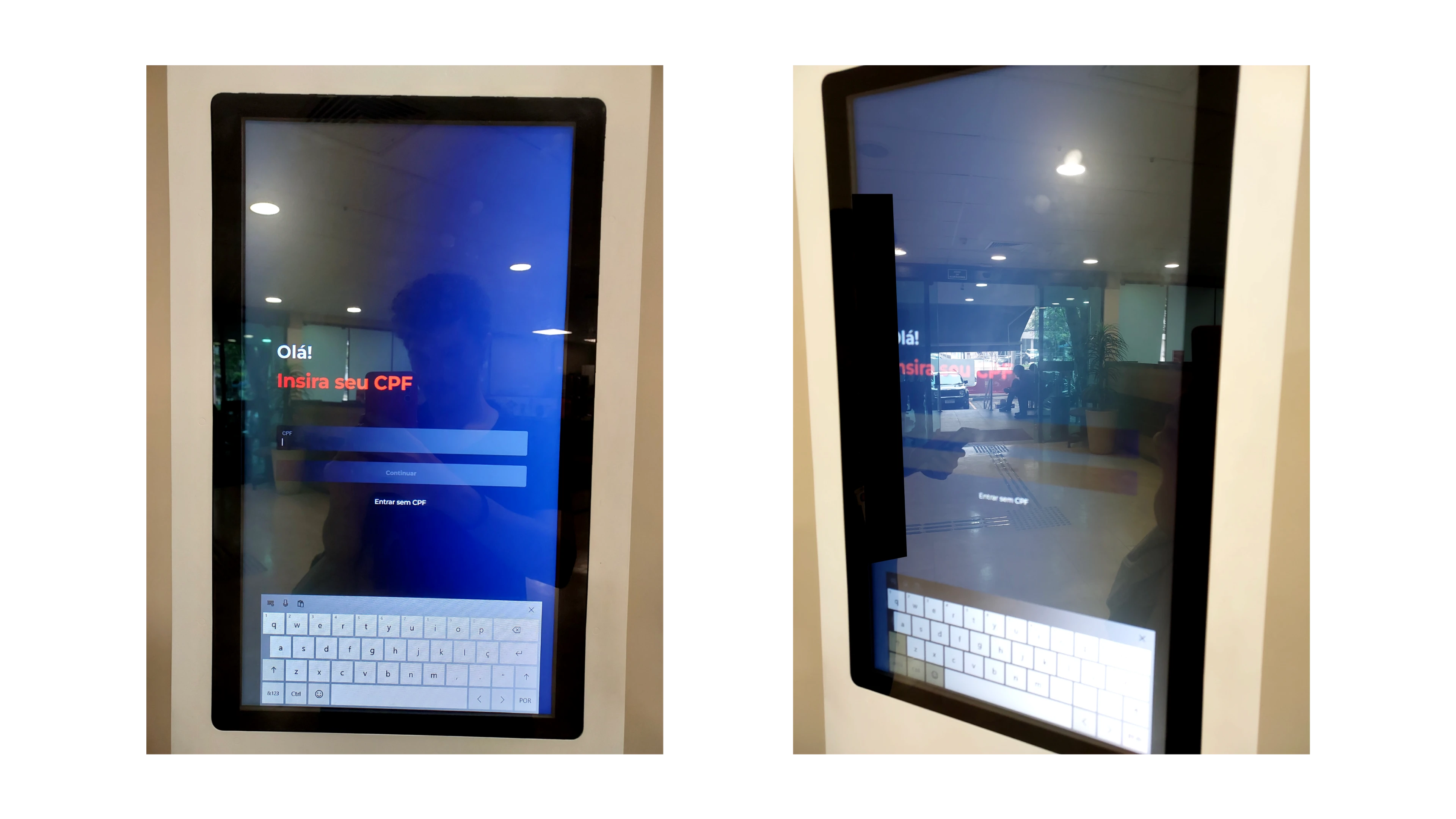
field photos from a real unit (anonymized)
Usability testing the queue flow
We also ran moderated usability sessions on the T3 collection-queue flow, asking people to say out loud what they made of each screen. Two problems kept coming up.
Wayfinding. The panel called patients as a generic “coleta” (“collection”) without saying which box, so people didn’t know where to go. As one note put it, “only ‘coleta’ shows, so he doesn’t know where to go.”
Unclear status. People couldn’t read the queue states. Looking at a “frozen” label, one tester said, “I didn’t get why he’s frozen. If he’s being attended, what does that mean? I didn’t understand.”
One dense panel view got called, flatly, “confusing, cluttered.” The lesson kept repeating: we were too close to the flow to judge it. As someone said in a session, “we’re too used to it; nothing beats testing with someone who doesn’t know it.”

usability findings: wayfinding and unclear status
A shared reference for how the screen behaves
I wrote these realities down as a shared reference in Figma so the team had one answer for why the UI looked the way it did. It kept the conversation grounded in how the screen actually behaves instead of personal taste.
That reference did real work in reviews. When I argued for the white background or a bigger type size, I could point at the way the kiosk really renders instead of defending a preference.
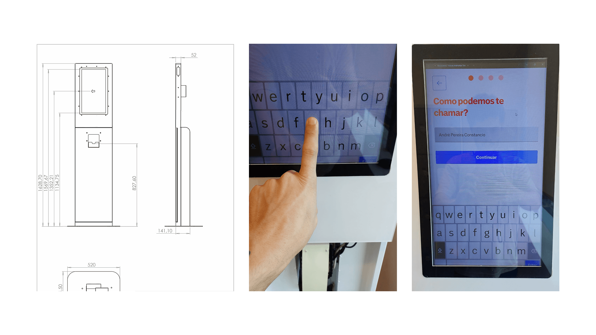
the shared reference frame in Figma
Design
White background instead of dark navy
The old design put a yellow card on a dark navy background. On a screen that dim, in a bright room, it went almost unreadable. The dark background just swallowed what little brightness there was.
A white-dominant layout with dark saturated blue text fixed legibility in any light: the screen reflects the room instead of fighting it. I also bumped up the type size and spacing so it still reads from a distance and off to the side.

before / after: dark navy vs white screen
One thing at a time
The old design piled everything onto the last card: patient name, queue panel, queue number, scheduled exam, QR code. As the team said, it was “too much information on the final screen,” when “the person’s attention on each screen is short.”
One observation sharpened it: once the patient takes the ticket, they stop reading. “After they pull the ticket, they kind of stop reading; they lose interest.” So I split the content across screens, even if that meant one more, and moved any offer to before the final screen, while the person was still paying attention. The primary action (where to go now) got its own space, separate from the secondary offer (Check-in). Elements got bigger, and whitespace did the work of guiding the eye.

single-focus layout: primary action separated from the offer
Directional, conversational copy
The old screens ran on system messages like “Aguarde na recepção” (“wait at reception”) or “Finalizar (0s)” (“finish”), the kind of text a rushed patient has to stop and decode.
In review, those finalization messages got called out as either too empty or overselling: “they’re either too empty, or selling something we won’t actually deliver.” The line the team kept coming back to was “the way we say it changes everything.” So the copy moved to plain, do-this language, checked in a group writing critique:
Before: “Aguarde na recepção” / After: “Dirija-se à Recepção 01 - 1º Andar” (“go to Reception 01, 1st floor”)
Before: “Finalizar (0s)” / After: “Já te coloquei na fila!” (“you’re in the queue!”)
Before: (no prompt) / After: “Quer esperar menos na fila?” (“want to wait less in the queue?”)
The goal: the patient knows exactly what to do without having to interpret anything.

copy comparison: old system text vs new conversational copy
Check-in as an explicit value proposition
In the old design, the Check-in QR code sat there as a small afterthought with no reason attached to it. Without a stated benefit, the reaction was predictable: “I don’t see any benefit here, so I won’t do it.”
The redesign spelled out the two benefits the team had pinned down: faster service at the counter, and priority in the queue. The framing was blunt on purpose, “you can skip the counter.” When a patient was eligible for T2=0 but hadn’t checked in, the screen said so plainly, “Para ter prioridade na fila, faça o Check-in,” (“to get priority in the queue, check in”) on its own screen with one clear call to action, kept apart from the queue confirmation.
It also lined the kiosk’s UI up with the Check-in team’s own push to cut T2, so the app journey and the in-person kiosk started feeding each other instead of running in parallel.

Check-in value-prop screen, naming the two benefits
QR vs SMS, decided by measurement
A recurring question was how to hand the patient off to their phone: a QR code on screen, an SMS link, or both. Instead of settling it by taste, we instrumented it. QR conversion looked low. “QR conversion is very low; people are doing it much more through the link.” So both the links and the QR codes were tagged so we could measure them, and A/B tested by unit (QR only, SMS only, or both), piloted in a few model units before any network-wide call.
It also forced a small UX rule. Scanning the QR effectively takes the ticket, so the check-in finalization screen couldn’t turn around and tell the patient to take a ticket again. That would have trapped them in a double action.
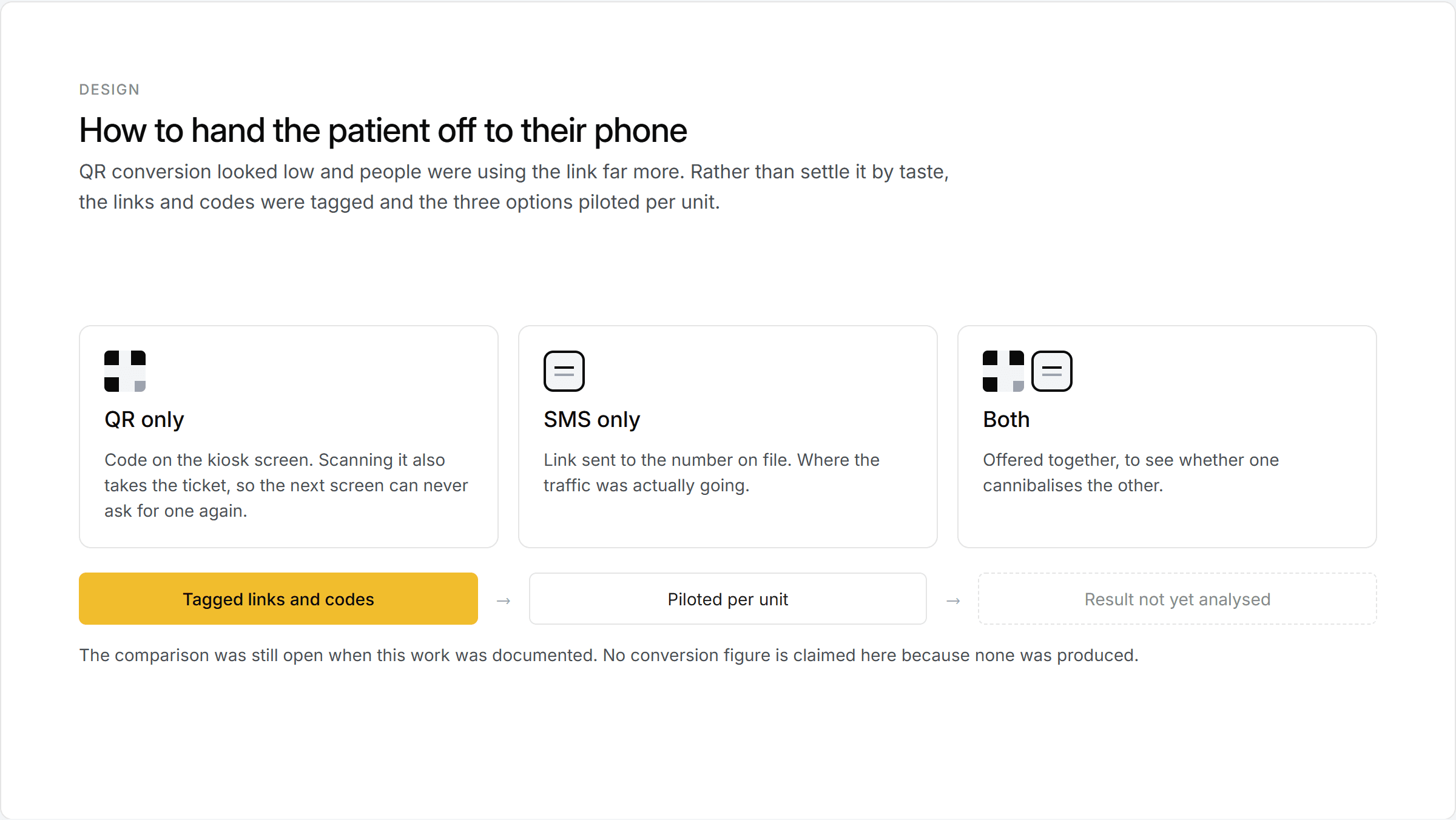
QR vs SMS: tagged and A/B tested by unit
Results
The before and after, side by side:
Background: dark navy to white, holds contrast in any light
Palette: navy + yellow to white + dark blue + primary blue
Layout: everything on one card to primary action separated from the secondary offer
Copy: system language (“Aguarde”, “Finalizar (0s)”) to directional and conversational
Check-in: QR with no context to a screen naming two benefits (skip the counter + queue priority)
Mobile hand-off: QR only, by assumption, to QR/SMS tagged and A/B tested by unit
Screen count: 18+ finalization states to a smaller, unified set
Validation and measurement
I took the redesign to the wider team in a design critique, with a separate writing review for the copy, and we tested new screens on real kiosk hardware in real units, not just in Figma, before sign-off.
The part I care about most: nothing got called “done” in the room. Anything that touched conversion (QR vs SMS, how a message was framed, where a physical piece went) was piloted in a model unit like Sumaré, the rebranding pioneer, with tagged links so we could watch what people actually did, then adjusted before the wider rollout.
Context & objective
T1, T2, T3: the patient journey
Dasa runs a network of 900+ diagnostic units and labs across Brazil. Inside a unit, the trip from arrival to exam is measured in three segments:
T1: arrival and queue ticket at the kiosk
T2: waiting to be called to the reception desk
T3: waiting for sample collection (e.g. blood draw)
The team’s big bet was “T2 = 0”: let an eligible patient skip the reception counter altogether. They authorize and pay on their phone and walk straight to the exam, so the T2 wait drops to zero. Digital Check-in, a mobile pre-admission flow, was what made that possible, and the self-service kiosk, called the Totem internally, was the in-unit bridge that pushed people toward it.
journey diagram, T1/T2/T3 and the skip-the-counter shortcut
The kiosk as a “digital host”
The idea was to make the kiosk behave like a digital host: read the patient on arrival and send them down the right path. Walk-ins go to Check-in; eligible patients go into the T2=0 flow. The in-house queue software, Tracking, was becoming the company’s official ticketing system.
It shipped in waves across 324 units in 2023. Phase 1 delivered the T1 and T2 modules: the queue ticket at the kiosk, the panels, and everything up to the counter. Phase 2 added the T3 collection-queue module in September. Units with the most check-in and T2=0 potential went first.
rollout phases, T1+T2 first, then T3
My role
I was the Product Designer on the UI redesign of the kiosk screens, in a chapter that also had a service designer and a UX researcher, working alongside product and engineering. Cutting down the flow explosion was a team effort. The visual redesign was mine: contrast, layout, information hierarchy, and the direction of the copy.
Problem
A different screen for every scenario
The kiosk’s finalization step branched on a handful of patient-state flags, and the screen changed with almost every combination. Without getting into the rules themselves, the rough shape was enough to explain the mess:
Check-in: 2 states
Registration: 3 states
Eligibility for the skip-the-counter path: 2 states
Appointment status: 3 states
Priority: 2 states
A handful of special cases on top
Multiply those out and you’re into the dozens. In practice they’d hardened into 18+ distinct finalization screens, and a patient in a hurry still had to read whichever one they got at a glance. As someone put it in an alignment meeting, “there’s a different case for each scenario.”
the sprawl of finalization screens
The screen wasn’t a normal monitor
The kiosk screen behaved nothing like the display I designed on, and that shaped every decision. A few things mattered more than any spec sheet:
Size and resolution were closer to a tablet than a desktop monitor, so there wasn’t much room and everything had to be bigger than it feels in Figma.
Contrast and color were off from a normal laptop or monitor, so a screen that looked clean in the Figma preview could come out washed out or muddy once it was actually running on the kiosk. I learned to stop trusting the preview.
Brightness was low, closer to a dimmed phone than a bright TV, which is rough in a lobby with daylight coming in.
Viewing angle mattered more than usual. A patient who was taller or shorter than average, or standing off to one side, lost contrast quickly.
The screen also caught glare.
So I checked designs on the real hardware instead of trusting my laptop, and kept the layout simple, large, and high-contrast.
how the design looked on a laptop vs. on the actual kiosk
Field research
Before any UI decision, we went to real Dasa units to see the actual context of use. This is the step that shaped the design direction the most.
On-site observations
Kiosks sat in wildly different light, from dim corridors to reception areas with direct sunlight
People approached from far off, well outside the angle where the screen still looked right
The interaction had to be fast. The kiosk is a throughput point, not a place to stop and puzzle over a screen
The dominant mood was anxiety and time pressure, not careful reading
field photos from a real unit (anonymized)
Usability testing the queue flow
We also ran moderated usability sessions on the T3 collection-queue flow, asking people to say out loud what they made of each screen. Two problems kept coming up.
Wayfinding. The panel called patients as a generic “coleta” (“collection”) without saying which box, so people didn’t know where to go. As one note put it, “only ‘coleta’ shows, so he doesn’t know where to go.”
Unclear status. People couldn’t read the queue states. Looking at a “frozen” label, one tester said, “I didn’t get why he’s frozen. If he’s being attended, what does that mean? I didn’t understand.”
One dense panel view got called, flatly, “confusing, cluttered.” The lesson kept repeating: we were too close to the flow to judge it. As someone said in a session, “we’re too used to it; nothing beats testing with someone who doesn’t know it.”
usability findings: wayfinding and unclear status
A shared reference for how the screen behaves
I wrote these realities down as a shared reference in Figma so the team had one answer for why the UI looked the way it did. It kept the conversation grounded in how the screen actually behaves instead of personal taste.
That reference did real work in reviews. When I argued for the white background or a bigger type size, I could point at the way the kiosk really renders instead of defending a preference.
the shared reference frame in Figma
Design
White background instead of dark navy
The old design put a yellow card on a dark navy background. On a screen that dim, in a bright room, it went almost unreadable. The dark background just swallowed what little brightness there was.
A white-dominant layout with dark saturated blue text fixed legibility in any light: the screen reflects the room instead of fighting it. I also bumped up the type size and spacing so it still reads from a distance and off to the side.
before / after: dark navy vs white screen
One thing at a time
The old design piled everything onto the last card: patient name, queue panel, queue number, scheduled exam, QR code. As the team said, it was “too much information on the final screen,” when “the person’s attention on each screen is short.”
One observation sharpened it: once the patient takes the ticket, they stop reading. “After they pull the ticket, they kind of stop reading; they lose interest.” So I split the content across screens, even if that meant one more, and moved any offer to before the final screen, while the person was still paying attention. The primary action (where to go now) got its own space, separate from the secondary offer (Check-in). Elements got bigger, and whitespace did the work of guiding the eye.
single-focus layout: primary action separated from the offer
Directional, conversational copy
The old screens ran on system messages like “Aguarde na recepção” (“wait at reception”) or “Finalizar (0s)” (“finish”), the kind of text a rushed patient has to stop and decode.
In review, those finalization messages got called out as either too empty or overselling: “they’re either too empty, or selling something we won’t actually deliver.” The line the team kept coming back to was “the way we say it changes everything.” So the copy moved to plain, do-this language, checked in a group writing critique:
Before: “Aguarde na recepção” / After: “Dirija-se à Recepção 01 - 1º Andar” (“go to Reception 01, 1st floor”)
Before: “Finalizar (0s)” / After: “Já te coloquei na fila!” (“you’re in the queue!”)
Before: (no prompt) / After: “Quer esperar menos na fila?” (“want to wait less in the queue?”)
The goal: the patient knows exactly what to do without having to interpret anything.
copy comparison: old system text vs new conversational copy
Check-in as an explicit value proposition
In the old design, the Check-in QR code sat there as a small afterthought with no reason attached to it. Without a stated benefit, the reaction was predictable: “I don’t see any benefit here, so I won’t do it.”
The redesign spelled out the two benefits the team had pinned down: faster service at the counter, and priority in the queue. The framing was blunt on purpose, “you can skip the counter.” When a patient was eligible for T2=0 but hadn’t checked in, the screen said so plainly, “Para ter prioridade na fila, faça o Check-in,” (“to get priority in the queue, check in”) on its own screen with one clear call to action, kept apart from the queue confirmation.
It also lined the kiosk’s UI up with the Check-in team’s own push to cut T2, so the app journey and the in-person kiosk started feeding each other instead of running in parallel.
Check-in value-prop screen, naming the two benefits
QR vs SMS, decided by measurement
A recurring question was how to hand the patient off to their phone: a QR code on screen, an SMS link, or both. Instead of settling it by taste, we instrumented it. QR conversion looked low. “QR conversion is very low; people are doing it much more through the link.” So both the links and the QR codes were tagged so we could measure them, and A/B tested by unit (QR only, SMS only, or both), piloted in a few model units before any network-wide call.
It also forced a small UX rule. Scanning the QR effectively takes the ticket, so the check-in finalization screen couldn’t turn around and tell the patient to take a ticket again. That would have trapped them in a double action.
QR vs SMS: tagged and A/B tested by unit
Results
The before and after, side by side:
Background: dark navy to white, holds contrast in any light
Palette: navy + yellow to white + dark blue + primary blue
Layout: everything on one card to primary action separated from the secondary offer
Copy: system language (“Aguarde”, “Finalizar (0s)”) to directional and conversational
Check-in: QR with no context to a screen naming two benefits (skip the counter + queue priority)
Mobile hand-off: QR only, by assumption, to QR/SMS tagged and A/B tested by unit
Screen count: 18+ finalization states to a smaller, unified set
Validation and measurement
I took the redesign to the wider team in a design critique, with a separate writing review for the copy, and we tested new screens on real kiosk hardware in real units, not just in Figma, before sign-off.
The part I care about most: nothing got called “done” in the room. Anything that touched conversion (QR vs SMS, how a message was framed, where a physical piece went) was piloted in a model unit like Sumaré, the rebranding pioneer, with tagged links so we could watch what people actually did, then adjusted before the wider rollout.
Context & objective
T1, T2, T3: the patient journey
Dasa runs a network of 900+ diagnostic units and labs across Brazil. Inside a unit, the trip from arrival to exam is measured in three segments:
T1: arrival and queue ticket at the kiosk
T2: waiting to be called to the reception desk
T3: waiting for sample collection (e.g. blood draw)
The team’s big bet was “T2 = 0”: let an eligible patient skip the reception counter altogether. They authorize and pay on their phone and walk straight to the exam, so the T2 wait drops to zero. Digital Check-in, a mobile pre-admission flow, was what made that possible, and the self-service kiosk, called the Totem internally, was the in-unit bridge that pushed people toward it.

journey diagram, T1/T2/T3 and the skip-the-counter shortcut
The kiosk as a “digital host”
The idea was to make the kiosk behave like a digital host: read the patient on arrival and send them down the right path. Walk-ins go to Check-in; eligible patients go into the T2=0 flow. The in-house queue software, Tracking, was becoming the company’s official ticketing system.
It shipped in waves across 324 units in 2023. Phase 1 delivered the T1 and T2 modules: the queue ticket at the kiosk, the panels, and everything up to the counter. Phase 2 added the T3 collection-queue module in September. Units with the most check-in and T2=0 potential went first.
rollout phases, T1+T2 first, then T3
My role
I was the Product Designer on the UI redesign of the kiosk screens, in a chapter that also had a service designer and a UX researcher, working alongside product and engineering. Cutting down the flow explosion was a team effort. The visual redesign was mine: contrast, layout, information hierarchy, and the direction of the copy.
Problem
A different screen for every scenario
The kiosk’s finalization step branched on a handful of patient-state flags, and the screen changed with almost every combination. Without getting into the rules themselves, the rough shape was enough to explain the mess:
Check-in: 2 states
Registration: 3 states
Eligibility for the skip-the-counter path: 2 states
Appointment status: 3 states
Priority: 2 states
A handful of special cases on top
Multiply those out and you’re into the dozens. In practice they’d hardened into 18+ distinct finalization screens, and a patient in a hurry still had to read whichever one they got at a glance. As someone put it in an alignment meeting, “there’s a different case for each scenario.”
the sprawl of finalization screens
The screen wasn’t a normal monitor
The kiosk screen behaved nothing like the display I designed on, and that shaped every decision. A few things mattered more than any spec sheet:
Size and resolution were closer to a tablet than a desktop monitor, so there wasn’t much room and everything had to be bigger than it feels in Figma.
Contrast and color were off from a normal laptop or monitor, so a screen that looked clean in the Figma preview could come out washed out or muddy once it was actually running on the kiosk. I learned to stop trusting the preview.
Brightness was low, closer to a dimmed phone than a bright TV, which is rough in a lobby with daylight coming in.
Viewing angle mattered more than usual. A patient who was taller or shorter than average, or standing off to one side, lost contrast quickly.
The screen also caught glare.
So I checked designs on the real hardware instead of trusting my laptop, and kept the layout simple, large, and high-contrast.
how the design looked on a laptop vs. on the actual kiosk
Field research
Before any UI decision, we went to real Dasa units to see the actual context of use. This is the step that shaped the design direction the most.
On-site observations
Kiosks sat in wildly different light, from dim corridors to reception areas with direct sunlight
People approached from far off, well outside the angle where the screen still looked right
The interaction had to be fast. The kiosk is a throughput point, not a place to stop and puzzle over a screen
The dominant mood was anxiety and time pressure, not careful reading
field photos from a real unit (anonymized)
Usability testing the queue flow
We also ran moderated usability sessions on the T3 collection-queue flow, asking people to say out loud what they made of each screen. Two problems kept coming up.
Wayfinding. The panel called patients as a generic “coleta” (“collection”) without saying which box, so people didn’t know where to go. As one note put it, “only ‘coleta’ shows, so he doesn’t know where to go.”
Unclear status. People couldn’t read the queue states. Looking at a “frozen” label, one tester said, “I didn’t get why he’s frozen. If he’s being attended, what does that mean? I didn’t understand.”
One dense panel view got called, flatly, “confusing, cluttered.” The lesson kept repeating: we were too close to the flow to judge it. As someone said in a session, “we’re too used to it; nothing beats testing with someone who doesn’t know it.”
usability findings: wayfinding and unclear status
A shared reference for how the screen behaves
I wrote these realities down as a shared reference in Figma so the team had one answer for why the UI looked the way it did. It kept the conversation grounded in how the screen actually behaves instead of personal taste.
That reference did real work in reviews. When I argued for the white background or a bigger type size, I could point at the way the kiosk really renders instead of defending a preference.
the shared reference frame in Figma
Design
White background instead of dark navy
The old design put a yellow card on a dark navy background. On a screen that dim, in a bright room, it went almost unreadable. The dark background just swallowed what little brightness there was.
A white-dominant layout with dark saturated blue text fixed legibility in any light: the screen reflects the room instead of fighting it. I also bumped up the type size and spacing so it still reads from a distance and off to the side.
before / after: dark navy vs white screen
One thing at a time
The old design piled everything onto the last card: patient name, queue panel, queue number, scheduled exam, QR code. As the team said, it was “too much information on the final screen,” when “the person’s attention on each screen is short.”
One observation sharpened it: once the patient takes the ticket, they stop reading. “After they pull the ticket, they kind of stop reading; they lose interest.” So I split the content across screens, even if that meant one more, and moved any offer to before the final screen, while the person was still paying attention. The primary action (where to go now) got its own space, separate from the secondary offer (Check-in). Elements got bigger, and whitespace did the work of guiding the eye.
single-focus layout: primary action separated from the offer
Directional, conversational copy
The old screens ran on system messages like “Aguarde na recepção” (“wait at reception”) or “Finalizar (0s)” (“finish”), the kind of text a rushed patient has to stop and decode.
In review, those finalization messages got called out as either too empty or overselling: “they’re either too empty, or selling something we won’t actually deliver.” The line the team kept coming back to was “the way we say it changes everything.” So the copy moved to plain, do-this language, checked in a group writing critique:
Before: “Aguarde na recepção” / After: “Dirija-se à Recepção 01 - 1º Andar” (“go to Reception 01, 1st floor”)
Before: “Finalizar (0s)” / After: “Já te coloquei na fila!” (“you’re in the queue!”)
Before: (no prompt) / After: “Quer esperar menos na fila?” (“want to wait less in the queue?”)
The goal: the patient knows exactly what to do without having to interpret anything.
copy comparison: old system text vs new conversational copy
Check-in as an explicit value proposition
In the old design, the Check-in QR code sat there as a small afterthought with no reason attached to it. Without a stated benefit, the reaction was predictable: “I don’t see any benefit here, so I won’t do it.”
The redesign spelled out the two benefits the team had pinned down: faster service at the counter, and priority in the queue. The framing was blunt on purpose, “you can skip the counter.” When a patient was eligible for T2=0 but hadn’t checked in, the screen said so plainly, “Para ter prioridade na fila, faça o Check-in,” (“to get priority in the queue, check in”) on its own screen with one clear call to action, kept apart from the queue confirmation.
It also lined the kiosk’s UI up with the Check-in team’s own push to cut T2, so the app journey and the in-person kiosk started feeding each other instead of running in parallel.
Check-in value-prop screen, naming the two benefits
QR vs SMS, decided by measurement
A recurring question was how to hand the patient off to their phone: a QR code on screen, an SMS link, or both. Instead of settling it by taste, we instrumented it. QR conversion looked low. “QR conversion is very low; people are doing it much more through the link.” So both the links and the QR codes were tagged so we could measure them, and A/B tested by unit (QR only, SMS only, or both), piloted in a few model units before any network-wide call.
It also forced a small UX rule. Scanning the QR effectively takes the ticket, so the check-in finalization screen couldn’t turn around and tell the patient to take a ticket again. That would have trapped them in a double action.
QR vs SMS: tagged and A/B tested by unit
Results
The before and after, side by side:
Background: dark navy to white, holds contrast in any light
Palette: navy + yellow to white + dark blue + primary blue
Layout: everything on one card to primary action separated from the secondary offer
Copy: system language (“Aguarde”, “Finalizar (0s)”) to directional and conversational
Check-in: QR with no context to a screen naming two benefits (skip the counter + queue priority)
Mobile hand-off: QR only, by assumption, to QR/SMS tagged and A/B tested by unit
Screen count: 18+ finalization states to a smaller, unified set
Validation and measurement
I took the redesign to the wider team in a design critique, with a separate writing review for the copy, and we tested new screens on real kiosk hardware in real units, not just in Figma, before sign-off.
The part I care about most: nothing got called “done” in the room. Anything that touched conversion (QR vs SMS, how a message was framed, where a physical piece went) was piloted in a model unit like Sumaré, the rebranding pioneer, with tagged links so we could watch what people actually did, then adjusted before the wider rollout.